
In our data-saturated world, the ability to make sense of overwhelming information streams is more crucial than ever before. The powerful craft of transforming abstract data into visually striking and insightful representations. As the beating heart of data literacy, this practice has rapidly evolved into an interdisciplinary necessity.

What is Data Visualization?
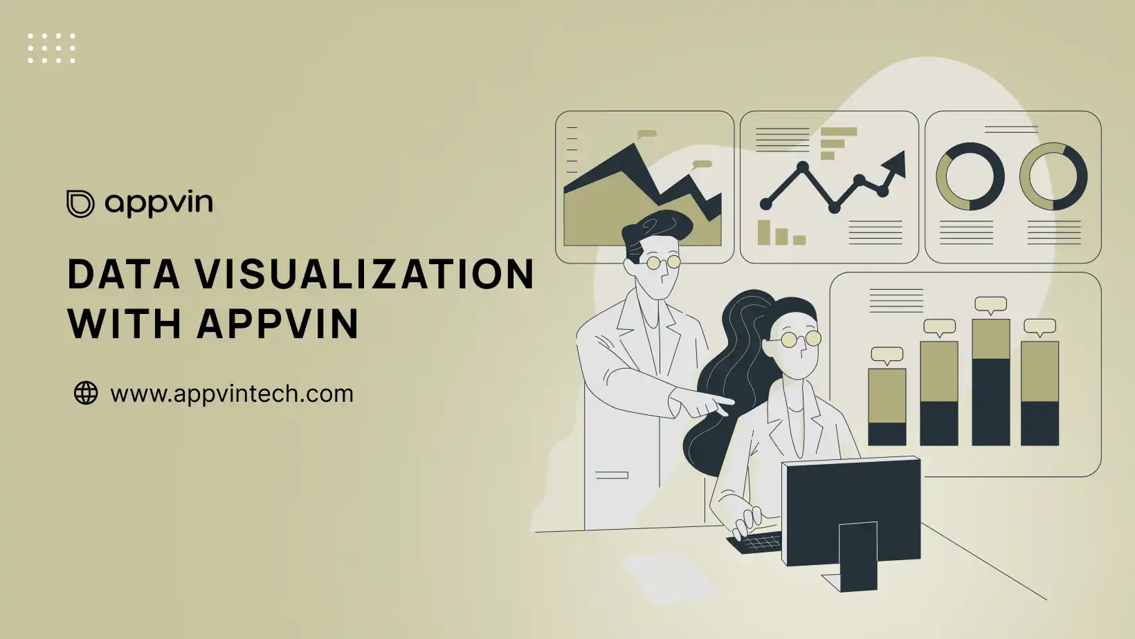
Data visualization is the graphical representation of data or information in a visual format, such as charts, graphs, maps, diagrams, or other illustrative formats. It is the practice of transforming complex datasets into visual elements that are easier for the human brain to interpret and understand.
The primary goal of data visualization is to communicate complex information clearly and effectively through visual aids. By leveraging the human mind’s ability to recognize patterns, trends, and outliers more efficiently through visual cues, data visualization techniques enable users to grasp insights and make data-driven decisions more quickly and accurately.

Some key aspects and purposes of data visualization include
Bridging the Gap: When Numbers Fail
Despite the “Information Age” , the sheer volume and complexity of data act as barriers blocking true comprehension for our minds. We have access to unlimited information yet grapple with biological constraints inhibiting our ability to effectively process it all. This is where the magic of data visualization shines – bridging the divide between abstract data and understanding.
Through graphical depictions tailored for human cognition, visualization techniques translate incomprehensible numbers into intuitive visuals. Raw data morphs into lucid stories, with kaleidoscopic patterns and trends leaping into vibrant focus. What was once indecipherable noise now sings in resonant visual harmonies composed for human understanding. In our visually-wired minds, data visualization permits us to perceive and harness the sublime intelligence pulsating through our modern data universe.
Paint by Numbers: A Multidimensional Canvas
While charts and graphs may be the celebrities, data visualization is a true renaissance discipline that extends far beyond those traditional formats. This versatile craft wields an array of powerful techniques across mediums and domains.
From mapping spatial intelligence to choreographing interactive dashboards, data visualization’s methods illuminate data landscapes in diverse ways. Dynamic platforms allow multi-dimensional data exploration, while conceptual illustrations transcend numbers entirely by rendering complex abstractions through symbolic imagery. Perhaps its most powerful capability lies in narrative data storytelling – guiding audiences through sequential visuals interwoven with context to unveil deeper meaning layer-by-layer.
These versatile discipline encompasses:
Spatial Mappings:
Geospatial data visualization harnesses the potential of intuitive map representations to unveil patterns, relationships, and insights within geographic locations and spatial datasets. This versatile technique spans various domains, including urban planning, transportation mapping, disease tracking, and environmental analysis. Moreover, in areas like demographic marketing, it aids in strategic decision-making by identifying customer segments and behavior trends in specific regions.
By translating intricate location intelligence into easily understandable visuals, geospatial visualization brings to light the hidden narratives embedded in the spatial fabric of our world.
Consequently, it serves as a powerful tool for uncovering valuable insights and facilitating informed decision-making in diverse fields.
Interactive Dashboards:
Custom analytics dashboards function as powerful data visualization cockpits, empowering stakeholders to visualize, monitor, and interact with real-time information flows from multiple vantage points. Unified on a single platform, these digital command centers synthesize disparate data streams into comprehensive visual landscapes, offering at-a-glance situational awareness that transcends flat, static reporting. By consolidating diverse sources, these dashboards streamline decision-making processes and enhance overall operational efficiency.
Through slick user interfaces, decision-makers seamlessly pivot between high-level overviews and deep dives, filtering insights through various lenses and dimensions. Dashboards democratize the freedom to manipulate, reconfigure, and absorb data on demand, transforming passive recipients into active pilots navigating their information ecosystems. This dynamic interaction enhances the agility of decision-makers, fostering a more informed and responsive approach to navigating complex data landscapes.
Conceptual Illustrations:
While numbers and charts may analyse quantitative data, artistic data visualizations bring abstract concepts and ideas to life through imaginative symbolic imagery. These conceptual illustrations transcend sterile digits and grids, instead embodying the heart and soul of a message through metaphoric visuals powered by elements like colors, textures, and shapes.
The creative representations spark deeper cognitive connections, allowing audiences to be emotionally captivated while their minds formulate more profound comprehension. When complex notions prove too lofty or nuanced for straightforward charts, this artistic form of storytelling through data-driven symbolism elevates engagement and resonance. Such pieces transform dense theories into works of aesthetic meaning, illuminating intangible insights through thoughtfully composed visual poetry.
Narrative-Driven Storytelling:
By thoughtfully sequencing visuals and layering contextual narrative elements, “data stories” have the power to artfully unveil deeper insights. These guided journeys take audiences on an illuminating step-by-step exploration through the data landscape. Each progression unlocks new meaning and perspective, with visualizations rhythmically complemented by supporting details, textual descriptions, and explanatory prose. The storyline unfolds almost cinematically – revealing pivotal chapters of understanding in cadenced intervals and cultivating an experiential path towards the profound conclusions embedded within the data’s core.
Through this narrative-driven approach, diverse audiences can be effectively captivated and immersed while seamlessly absorbing the evidence, reasoning, and takeaways that may have once seemed dense or impenetrable. Data stories elevate communication from flat recitations of numbers into engaging explorations capable of shifting assumptions and leaving indelible impressions.

The Universal Communicator
In our modern era, nearly every sphere is increasingly fueled by data and quantitative evidence. From boardrooms to labs, critical decisions hinge on gleaning insights from digital information torrents. Mastering data visualization has thus evolved into an essential skill – a core literacy for professionals navigating our data-saturated world.
Businesses adopt visualization for performance snapshots through dashboards. Scientists rely on techniques like genomic mapping visualizations. Policy makers leverage clear data depictions to highlight societal issues and impacts. Journalists use data-driven visuals to convey research, events and statistics. From corporations and research labs to civic organizations and newsrooms, the demand is clear – professionals fluent in communicating intricate data through imagery will emerge as polymath leaders of the information age.
These versatile discipline encompasses:
Business Intelligence:
In the fast-paced business world, visualizations have become indispensable lenses that crystallize mission-critical intelligence into at-a-glance snapshots. Executives and decision makers across industries rely on these powerful visual aids to quickly assess the vital signs of their operations through intuitive depictions of key performance metrics and KPIs. Dynamic visualizations illuminate emerging trends and market shifts before they become disruptions.
Customer demographics, behaviors, and sentiment snapshot visualizations steer marketing, sales, and product strategies. From supply chain logistics to talent management, visual reporting provides continuous real-time visibility into operational efficiencies and pinpoints areas requiring intervention. By condensing overwhelming data streams into digestible visualizations, these solutions empower leaders to absorb and respond to complexities with exceptional efficiency.
Scientific Research:
In the realms of scientific inquiry and discovery, visualization techniques have become indispensable utilities for both analyzing complex data and communicating findings. For disciplines like genomics and bioinformatics, ingenious visualizations map the intricate structures and sequences of life’s molecular codes – rendering the invisible architecture of DNA and proteins into cognizable models. Biochemists leverage visualizations to depict and examine the geometry of novel chemical compounds and therapeutic molecules. From illustrating fluid dynamics to simulating high-energy particle collisions, visualizations allow researchers to represent, interact with, and interrogate data that would otherwise exist as impenetrable statistics.
These powerful tools illuminate previously indiscernible patterns and relationships within vast datasets. Perhaps most crucially, visualizations transcend data, transforming it into insightful stories and visceral visuals that broadcast revolutionary discoveries to the world.
Public Policy:
Intuitive data visualizations play a pivotal role in driving societal change and progress. They effectively bring attention to inequalities, demographic patterns, and the impacts of policy interventions, providing a voice to the quantitative evidence supporting urgent social causes. By vividly depicting disparities in areas such as income, education, and healthcare, these visualizations compel audiences and decision-makers to acknowledge and take action. Furthermore, they serve as crucial tools for tracking the efficacy of social programs and publicly advocating for the most vulnerable communities.
For policymakers, these tools provide an unassailable basis for data-driven recommendations on issues like resource allocation, public service planning, and regulation. When stories of injustice and inequality are rendered visible through comprehensible visuals, the data manifests into an authoritative call for reform that can compel even the most resolved skeptics into addressing systemic challenges. Visualizations transform societal issues from dense statistics into vivid, accessible, and ultimately indefensible realities.
News and Journalism:
In the current information-rich landscape, data visualizations are crucial tools. They cut through the noise, presenting key events, statistics, and research findings succinctly. Visualizations capture attention instantly, distilling the signal from surrounding static with compelling visuals that highlight crucial insights. During significant events such as elections or crises, they offer accessible, at-a-glance snapshots of vital data points.
Scientific research findings that may have previously been inaccessible due to complex statistics and jargon can be powerfully communicated through intuitive charts, graphics, and conceptual illustrations. News media leverages visualizations to enhance reporting and clarify the broader context surrounding major developments. Whether for the general public or targeted audiences, visualizations transform dense data into compact, comprehensible visuals that transcend text, elevating informational clarity amid the modern language of content inundation.
Conclusion
In the era of information overload, data visualization emerges as a vital skill, bridging the gap between complexity and comprehension. From spatial mappings to interactive dashboards, it transforms raw data into captivating narratives. This universal communicator is essential in diverse fields, from business intelligence to scientific research, public policy, and journalism. As we navigate a data-saturated world, mastering data visualization becomes imperative. Elevate your skills with Appvin Technologies—an innovative leader empowering professionals to communicate intricate data seamlessly through cutting-edge visualization solutions.
As a premier business intelligence services company, we excel in data visualization. Leveraging cutting-edge tools and techniques, we transform complex datasets into intuitive visuals that drive understanding and decision-making. Our expertise ensures that insights are conveyed effectively, empowering clients to make informed strategic choices for their businesses.
FAQs
1. Why is data visualization becoming increasingly important?
Data visualization is becoming crucial because of the ever-growing volume of data being generated. Analyzing and understanding this data in its raw form is difficult and time-consuming. Data visualization translates complex data sets into easily digestible visual formats like charts, graphs, and maps, allowing users to:
- Identify trends and patterns that might be missed in raw data.
- Gain deeper insights and make data-driven decisions more effectively.
- Communicate complex information to a wider audience in a clear and concise way.
2. Who benefits from data visualization?
Data visualization benefits a wide range of individuals and professions, not just data analysts and scientists. Here are a few examples:
- Business professionals: Use data visualization to understand customer behavior, track sales performance, and make informed strategic decisions.
- Educators and researchers: Can present complex concepts and research findings in a way that is easier for students and the public to understand.
- Policymakers: Can leverage data visualization to gain insights into social issues, track the effectiveness of policies, and make informed decisions for the public good.
3. What are some of the key considerations for effective data visualization?
Creating effective data visualizations requires careful planning and execution. Here are some key considerations:
- Choosing the right visual format: Different charts and graphs are better suited for different types of data and purposes.
- Ensuring clarity and accuracy: The visualization should be easy to understand and interpret, with clear labeling and appropriate use of color and design elements.
- Avoiding misleading information: The visualization should represent the data accurately and fairly, without manipulating or distorting the information.